Tuesday, 18 April 2017

Evaluation 4: Who would be the audience for your media product? - WORD/SLIDESHARE


Socio-Economic Scale:

A - higher managerial administrative professionals

B - intermediate administrative professionals

C1 - supervisory, clerical, junior administrative professionals 
C2 - skilled manual workers

D - semi / unskilled workers

E - state pensioners with little / no income, widows, minimum pay earners, and the unemployed


Target Audience Profile

In general, thriller films often target the lower end of the Socio-Economic Scale. They typically target those who are often less successful AND/OR poorer, and use such films as escapism - according to the Uses and Gratification Theory (the theory that suggest why audiences use a piece of media). As a result, my film Forest Horror targets males aged 13-21 who are situated on the C1 - E, as they can view the film, at box office and the also contribute to the primary fanbase of Netflix. Moreover Forest Horror also has a secondary  audience of females aged 14-22 as women are shown (in some research) to be enjoy thriller films more than male counterparts, and they (in most market research) watch more commercial television and are therefore more likely to interact with our film's TV marketing campaign. 

Target Audience Profile
As outlined in previous posts, our perfected audience member would be:

IDEAL CANDIDATE
NAME: James Lloyd
AGE: 17
OCCUPATION: Student / Part-Time  
GENDER: Male
ETHNICITY: White (western - UK/USA)
INTERESTS: Rugby, Football, Social Media


Moreover, this audience is from the C1-E categories as they're most likely to want to view our product as they can find it relatable. Due to our audience's low age they're likely to be attracted to the main character of the film - an award-winning young actor. What's more, while our opening is sad (the murders and the protagonist's treatment while in police custody - them thinking he's the one responsible) can be seen as relatable as, generally younger generations have negative interactions with the police. This can link to the Uses and Gratification - according to social interaction and identity (meaning our audiences can both relate and empathise with our protagonist.

Finally, the fact that our protagonist is brought to his knees by the murderer and yet can rise up again to beat him (as scene in the opening scene) can link to our audience. This is due to Maslow's Hierarchy of Needs as the audience thinks that if our protagonist can rise up, then so can they - which relates to Maslow's Hierarchy of Needs.


#1T4TS
Alex

Wednesday, 12 April 2017

Evaluation 1: In what ways does your media product use, develop or challenge forms and conventions of real media products? PUBLISHER/SLIDESHARE


Image result for curse of chucky flashbackBut the contrast in the black and white scenes is effective as it is a convention used in other thriller films, such as the Curse of Chucky. This alternate lighting is bizarre and acts as hermeneutic code. The sudden change in colour suggests that something is wrong or is about to happen. It is often used to show the past, and it acts as hermeneutic code - the audience knows something has happened/is about to happen and are therefore engaged as they try to work out what's going on.


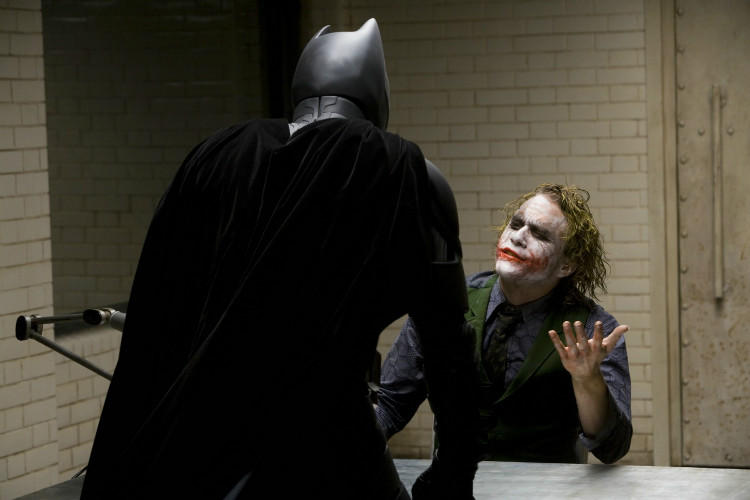
Our target audience can relate to the protagonist situation as - due to the fact that teenagers generally have negative interactions with the police. While there may be no violence (unlike the Dark Knight) and our main character is not the villain, it is clear that the police are treating the protagonist like a villain, and this not only gains sympathy for the main character but also, through Maslow's Hierarchy of Needs, it gives a sense of connection (via the love and belonging section of Maslow's Hierarchy of Needs). In that way, one can argue that we followed the stereotype of teenagers interactions with the police due to the fact that teenagers are stereotypically involved with the police because they've committed the crime, not been the victim.


Also the common convention of most films in general (particularly horror and thriller movies) the killer often remains anonymous. And although the protagonist knows the identity of the murderer / antagonist. This goes against the general convention of the protagonist having to work out who the murderer is. The theme of a mask is not only for realistic purposes, as it covers the antagonist's face; but it symbolises the hidden intentions of the antagonist - as the other characters don't know what's going to happen


One can draw parallels between the setting used in Silence of the Lambs and The Forest. The same woodland environment provides the same lack of lighting. This creates an eerie scene as not much can be seen. This acts as both hermeneutic and proairetic code. This is due to the fact that this part of the scene is both a transition between actions, and it, itself is connoting something is going to happen itself. This is due to the fact that we know only one person will escape and therefore seeing him hours earlier makes the audience think what happened?

The use of special effects (SFX) was a convention adopted from Se7en. Se7en uses SFX to transition between different parts / elements of the scene didn't use. We adopted the same uses of SFX as it is conventional.


Monday, 10 April 2017

Lighting Techniques


The use of natural lighting was imperative in the forest scenes, it gave a sense of reality that could not have been achieved via the use of artificial light. With the added black and white effect, the natural light was emphasised, creating a distorted mindset - which represents our protagonist's understanding of what has gone one. The fractured light which filtered through from the tree
let beams of light come through the undergrowth. This  black and white effect couldn't have been used previously due to previous light implications, and as a result, we had to reshoot. But the contrast in the black and white scenes is effective as it is a convention used in other thriller films, such as the Curse of Chucky.
use of b&w to highlight the contrast in

Friday, 7 April 2017

Typography


Typography & It's Uses

To show our credits - featuring our director's/editor's names etc. - we used the a sans serif-like font, as it was functional and served no other purpose than to showcase our personnel. Moreover, the font of a title, may symbolise what a films about, its genre

The idea stated in the video - "less is more" - is one we (my group) incorporated into our opening scene. As stated above, our text used to show our actors and film crew in a plain and simple way, a convention that is used throughout the film industry, let-alone the thriller genre.

Image result for Taken (film)
The bold text in the film's title suggests that the film is a blockbuster - big films such as Taken often share similarities in their fonts regardless of genre - the use of red suggests that it's an action film, or, at the very least, incorporates action into the film. Also - as previously stated - the lead actors and such are given a plain, unassuming text to showcase their names, a convention we (as a group) followed during our preparation of our films.


Tuesday, 4 April 2017

Characters + Profiles


Each film has it's actors, and they're usually mentioned in the credits (along with the directors, camera crew and editors); but if - for whatever reason - we don't have credits, here they are:


CAST
Khaleem Hussain starring as Jayden Yusuf: the star of our story, a mid/late teenager, a footballer who          witnesses
Ella Robbertson starring as Murdered Girl no. 1
Ellie Hogan starring as Murdered Girl no. 2
Lucy Henderson starring as Murdered Girl no. 3
Davina starring as Mystery Girl no. 4 / Missing Girl
Alexander Bell starring as D. I. Walker:. I. Walker
Joel Coupie starring as the Killer


CREW
Mateusz Boruszewski - Editor
Alexander Bell - Director
Khaleem Hussain - Music Producer