Saturday, 29 April 2017

Evaluation 7: Looking back at your preliminary task (the continuity editing task), what do you feel you have learnt in the progression from it to full product?


Our Pre-Lim: completely rubbish, but a good place to start. Creating a film isn't easily - let alone one scene. The lighting (which we couldn't control, and also the glare of the walls/wall displays meant that made the corridor so well-lit (never thought I'd complain about lighting being 'too good') that the surroundings attract more attention than our actor. The camera angles, were all wrong, meaning that there wasn't enough focus on the characters and their emotions. The mise-en-scene/setting (as we've already said) was inadequate, we worked with it but a school environment was not the perfect scene for a film. The audio was sub-par at best, whether this was due to our filming technique or the fact that our environment wasn't perfect in terms of acoustics. It was just one big storm of basic mistakes.


But it led to this...


This is everything. The progress made from our original Pre-Lim has been incredible. Everything that's in our opening scene is there for a reason and has been analysed as such. Our production company's logo is a burning candle, which is a metaphor for life and death. This also infers/relates to the type of films that our company might produce. The black and white filter simulates a security/CCTV camera, which makes our film look legitimate, this is in addition to the security camera signs added in the edit. All of this makes our audience believe what is going on and believing it, buying into the story, is a guaranteed way of gaining success at the box office.

Our own music was created. The dark, low tones connote danger - acting as hermeneutic code. The use of black and white in the second part of the scene is a convention used in flashback scenes in general - but was adopted from the film Curse of Chucky.

The female characters in our film are shown to be weak and helpless, a convention shown throughout the thriller and horror genres. It may not be necessarily relatable to audiences (there are strong women out there), however, following the convention is what makes films successful. Moreover, the audience are on the same level as the protagonist/main character as they know as much as he does. They're left to ask why? What? Who? etc. We utilised the natural lighting from the trees to create a half-lit set. This created an eerie atmosphere that insinuates that something bad is going to happen. Moreover, our young audience can relate to our main character's interactions with the police. While the audience knows our character is innocent, the police do not, and their accusing nature is something that our audience may empathise with (via their experiences) and is sadly quite realistic.

To summarise, the main focus point of our short opening was to be realistic. It went into such depth that we would obsess over the tiniest continuities, but from this I can say we've advanced from our Pre-Lim into something great.

Monday, 24 April 2017

Evaluation 6: What have you learn about technologies from the process of constructing this product?


Tuesday, 18 April 2017

Evaluation 4: Who would be the audience for your media product? - WORD/SLIDESHARE


Socio-Economic Scale:

A - higher managerial administrative professionals

B - intermediate administrative professionals

C1 - supervisory, clerical, junior administrative professionals 
C2 - skilled manual workers

D - semi / unskilled workers

E - state pensioners with little / no income, widows, minimum pay earners, and the unemployed


Target Audience Profile

In general, thriller films often target the lower end of the Socio-Economic Scale. They typically target those who are often less successful AND/OR poorer, and use such films as escapism - according to the Uses and Gratification Theory (the theory that suggest why audiences use a piece of media). As a result, my film Forest Horror targets males aged 13-21 who are situated on the C1 - E, as they can view the film, at box office and the also contribute to the primary fanbase of Netflix. Moreover Forest Horror also has a secondary  audience of females aged 14-22 as women are shown (in some research) to be enjoy thriller films more than male counterparts, and they (in most market research) watch more commercial television and are therefore more likely to interact with our film's TV marketing campaign. 

Target Audience Profile
As outlined in previous posts, our perfected audience member would be:

IDEAL CANDIDATE
NAME: James Lloyd
AGE: 17
OCCUPATION: Student / Part-Time  
GENDER: Male
ETHNICITY: White (western - UK/USA)
INTERESTS: Rugby, Football, Social Media


Moreover, this audience is from the C1-E categories as they're most likely to want to view our product as they can find it relatable. Due to our audience's low age they're likely to be attracted to the main character of the film - an award-winning young actor. What's more, while our opening is sad (the murders and the protagonist's treatment while in police custody - them thinking he's the one responsible) can be seen as relatable as, generally younger generations have negative interactions with the police. This can link to the Uses and Gratification - according to social interaction and identity (meaning our audiences can both relate and empathise with our protagonist.

Finally, the fact that our protagonist is brought to his knees by the murderer and yet can rise up again to beat him (as scene in the opening scene) can link to our audience. This is due to Maslow's Hierarchy of Needs as the audience thinks that if our protagonist can rise up, then so can they - which relates to Maslow's Hierarchy of Needs.


#1T4TS
Alex

Wednesday, 12 April 2017

Evaluation 1: In what ways does your media product use, develop or challenge forms and conventions of real media products? PUBLISHER/SLIDESHARE


Image result for curse of chucky flashbackBut the contrast in the black and white scenes is effective as it is a convention used in other thriller films, such as the Curse of Chucky. This alternate lighting is bizarre and acts as hermeneutic code. The sudden change in colour suggests that something is wrong or is about to happen. It is often used to show the past, and it acts as hermeneutic code - the audience knows something has happened/is about to happen and are therefore engaged as they try to work out what's going on.


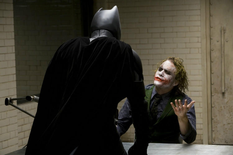
Our target audience can relate to the protagonist situation as - due to the fact that teenagers generally have negative interactions with the police. While there may be no violence (unlike the Dark Knight) and our main character is not the villain, it is clear that the police are treating the protagonist like a villain, and this not only gains sympathy for the main character but also, through Maslow's Hierarchy of Needs, it gives a sense of connection (via the love and belonging section of Maslow's Hierarchy of Needs). In that way, one can argue that we followed the stereotype of teenagers interactions with the police due to the fact that teenagers are stereotypically involved with the police because they've committed the crime, not been the victim.


Also the common convention of most films in general (particularly horror and thriller movies) the killer often remains anonymous. And although the protagonist knows the identity of the murderer / antagonist. This goes against the general convention of the protagonist having to work out who the murderer is. The theme of a mask is not only for realistic purposes, as it covers the antagonist's face; but it symbolises the hidden intentions of the antagonist - as the other characters don't know what's going to happen


One can draw parallels between the setting used in Silence of the Lambs and The Forest. The same woodland environment provides the same lack of lighting. This creates an eerie scene as not much can be seen. This acts as both hermeneutic and proairetic code. This is due to the fact that this part of the scene is both a transition between actions, and it, itself is connoting something is going to happen itself. This is due to the fact that we know only one person will escape and therefore seeing him hours earlier makes the audience think what happened?

The use of special effects (SFX) was a convention adopted from Se7en. Se7en uses SFX to transition between different parts / elements of the scene didn't use. We adopted the same uses of SFX as it is conventional.


Monday, 10 April 2017

Lighting Techniques


The use of natural lighting was imperative in the forest scenes, it gave a sense of reality that could not have been achieved via the use of artificial light. With the added black and white effect, the natural light was emphasised, creating a distorted mindset - which represents our protagonist's understanding of what has gone one. The fractured light which filtered through from the tree
let beams of light come through the undergrowth. This  black and white effect couldn't have been used previously due to previous light implications, and as a result, we had to reshoot. But the contrast in the black and white scenes is effective as it is a convention used in other thriller films, such as the Curse of Chucky.
use of b&w to highlight the contrast in

Friday, 7 April 2017

Typography


Typography & It's Uses

To show our credits - featuring our director's/editor's names etc. - we used the a sans serif-like font, as it was functional and served no other purpose than to showcase our personnel. Moreover, the font of a title, may symbolise what a films about, its genre

The idea stated in the video - "less is more" - is one we (my group) incorporated into our opening scene. As stated above, our text used to show our actors and film crew in a plain and simple way, a convention that is used throughout the film industry, let-alone the thriller genre.

Image result for Taken (film)
The bold text in the film's title suggests that the film is a blockbuster - big films such as Taken often share similarities in their fonts regardless of genre - the use of red suggests that it's an action film, or, at the very least, incorporates action into the film. Also - as previously stated - the lead actors and such are given a plain, unassuming text to showcase their names, a convention we (as a group) followed during our preparation of our films.


Tuesday, 4 April 2017

Characters + Profiles


Each film has it's actors, and they're usually mentioned in the credits (along with the directors, camera crew and editors); but if - for whatever reason - we don't have credits, here they are:


CAST
Khaleem Hussain starring as Jayden Yusuf: the star of our story, a mid/late teenager, a footballer who          witnesses
Ella Robbertson starring as Murdered Girl no. 1
Ellie Hogan starring as Murdered Girl no. 2
Lucy Henderson starring as Murdered Girl no. 3
Davina starring as Mystery Girl no. 4 / Missing Girl
Alexander Bell starring as D. I. Walker:. I. Walker
Joel Coupie starring as the Killer


CREW
Mateusz Boruszewski - Editor
Alexander Bell - Director
Khaleem Hussain - Music Producer


Friday, 31 March 2017

Production Company Logo - Progress & Brief Analysis


One can see that the candle represents a metaphor for life and death - like a candle, life can as easily, and as quickly, be snuffed out. This suggests what kind of film may be shown - for example seeing a Warner Bros. logo would suggest that a the film is likely to be part of the action or fantasy genre. In this case, our production company logo suggests death, horror, and thriller.

In addition, this engages the audience as, the opening scene suggests death, therefore, this logo acts as hermeneutic code as the audience may begin to think is someone going to die? And if so, who?
However, the disadvantage of this logo is that many of these subtle nuances may not be picked up by the film's younger audiences.


On reflection, one can see that the previous candle logo is quite primitive, and amateur-looking; therefore we changed the candle to a more realistic image. This addition makes the logo more ominous, suggesting a grim fate of a character within the film. What's more the gothic text that floated in on the previous logo, looked clumsy; and as a result the animation was changed to a fade-in animation. Finally, the issue of our production logo being too complex for the audience to understand has been quashed. We asked people what type of film our production company produced - the most popular results being horror, thriller, murder-mystery.

Friday, 24 March 2017

Behind The Scenes & Bloopers / Evidence of Filming


As the title suggests, these are the scenes that didn't quite make it to the rough cut. Whether it was noise, lighting, props, or unwanted backgrounds, it was a plethora of mistakes. The lighting was very temperamental which led to several looking too bright, too dark - just unprofessional in general.  An inadequate classroom and unwanted mise-en-scene meant that our "interview room" looked like a classroom, which made our storyline seem unrealistic. Moreover, the excess sound of the cleaners hoovering in the background furthers the idea of the being unprofessional, and as a result we had to do a reshoot, brief appearance of my chain. And finally, most of our problems have been to do with external influences; however, this mistake is human error - mine to be precise. The brief appearance of my chain in shot was not expected, neither was it noticed until the end of our filming, and it did not fit the atmosphere of our film.

To summarise there were multiple reasons for us needing to reshoot: the lighting, unwanted mise-en-scene, excess noise, my chain (sorry Matt & Khaleem). But don't worry, onwards and upwards...


Friday, 17 February 2017

Animatic


This wasn’t how things were supposed to turn out, we’d meant to be having a laugh, and we see our character’s (Jayden Yusuf) features and surroundings: he’s in a police interviewing room, he’s clothes are shredded and covered in mud, he has a gash to his cheek, and his curly hair is saturated / soaked in blood. There is also screaming and a heartbeat as non-diegetic, incidental audio. Cut to (high angle / eagle-eye shot - camera is grainy / poor quality, symbolising CCTV at a police station) our protagonist, there is little / no audio as we are emphasising to the audience that the protagonist is on his own. Audience hears screams even though we see that the protagonist is alone (establishing shot - colour is now present, quality is good - we have incidental audio getting louder; we also see cuts of POV shots from the protagonist viewpoint, we see a view of his feet running, brief look over his shoulder, the audience also hear heavy breathing as non-diegetic sound). The incidental audio - screams and heartbeat - grows louder and louder until the protagonist screams ENOUGH!!” - in a slightly higher / deeper voice - and he slams his fist against the table.                                          

Friday, 10 February 2017

Music Analysis


Sound
Isn't it funny how a piece of music can become synonymous with a film, or TV show? Sound is something that is seen as a minor part of film. Other factors such as camera angle, image quality, script are frequently prioritised over sound. Music is a narrative device that helps explain, and may also give further context to, the plot and it is an essential part of a film and can even enhance an audience’s experience. For example the music above (Doctor Who) is synonymous with the show, regardless of whether we see the T.A.R.D.I.S or the Doctor.

There are multiple classification types for sound in film:


  •  Parallel Sound: sound that compliments, and goes along with the story that is unfolding on the scene, to may also add extra atmosphere to the scene
  • Contrapuntal Sound: sound that contrasts with what is being on screen, it is used for comical purposes, and it may also be used to make light of what is going on in the scene

Friday, 3 February 2017

Props & Equipment


Props:


Tables
Chairs
Adidas ZNE Hoodie
Fake Blood - red food colouring, corn flour, and water
Police badge


Equipment:


Canon 100 etc.
Tripod
Lights (lights used for back light etc.)